
Speed matters in your daily work. That’s why at ITscope, we’re continuously refining the platform to make it clearer, more structured, and easier to navigate—so you can move through ITscope and find information more efficiently (UX/UI). The new product page is already live—and this is just the beginning. Here’s what’s changed so far, and what’s coming next.
Product Page: Clear Structure for Faster Orientation
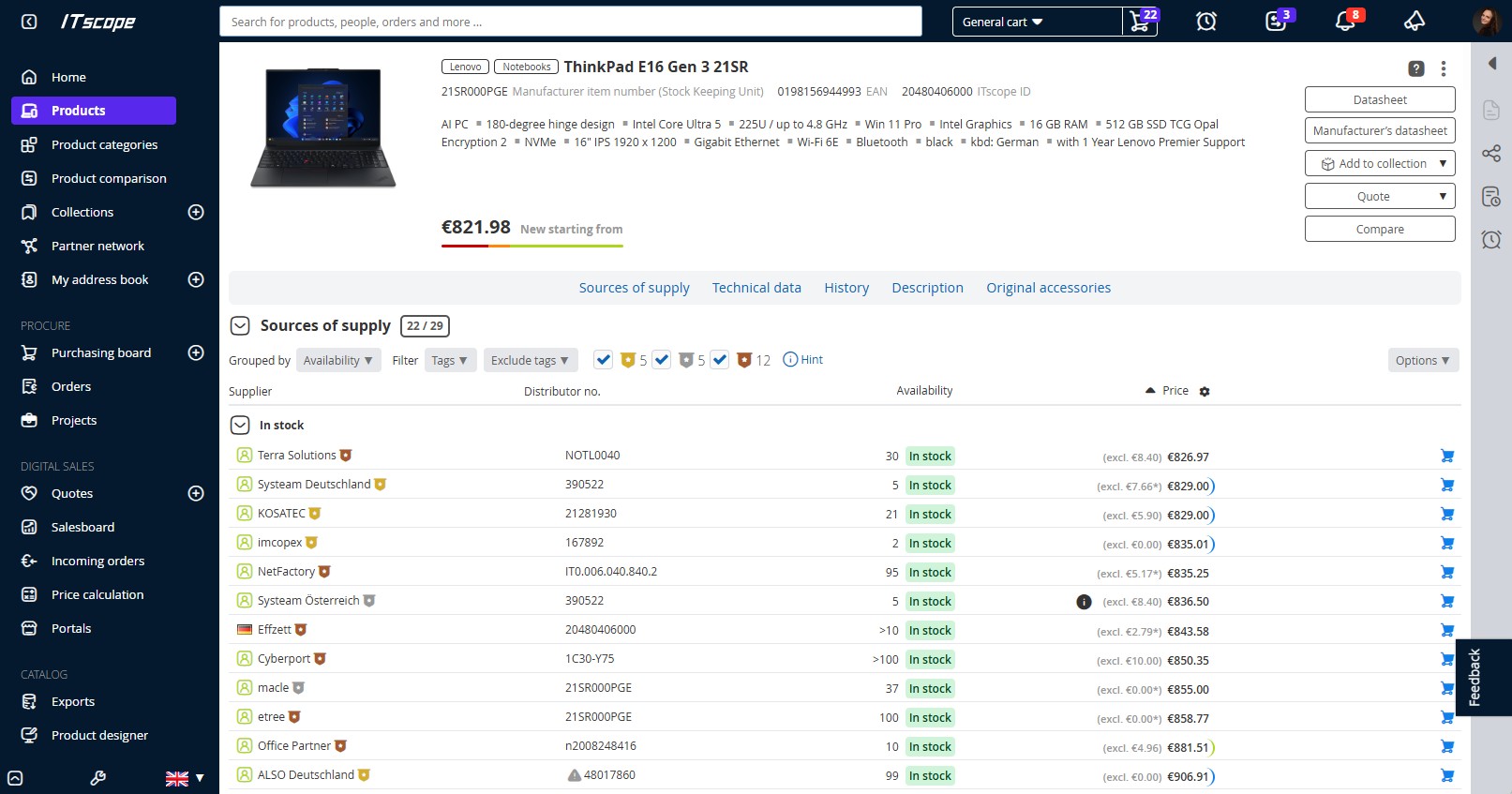
The product page now features a cleaner layout that guides you through all relevant information in a structured way. Content is logically organized and easy to scan, with key details always in the same place.
At the same time, we’ve reduced visual clutter to help you focus on what matters most for your decisions. The pricing and sales view has also been simplified: for example, there is now only a single cart button, allowing you to add products directly to your selected cart.
When viewing suppliers, you can instantly see whether they are already part of your network—thanks to clear indicators like the user icon or country flag.
Icons and the Color Purple: Small Changes, Big Impact
A redesigned icon set creates a more consistent visual language, making it easier to recognize functions at a glance—no need to search or second-guess. In addition, we’re now using the color purple more deliberately to highlight active menu items and important indicators, such as badges (small notification labels with numbers).
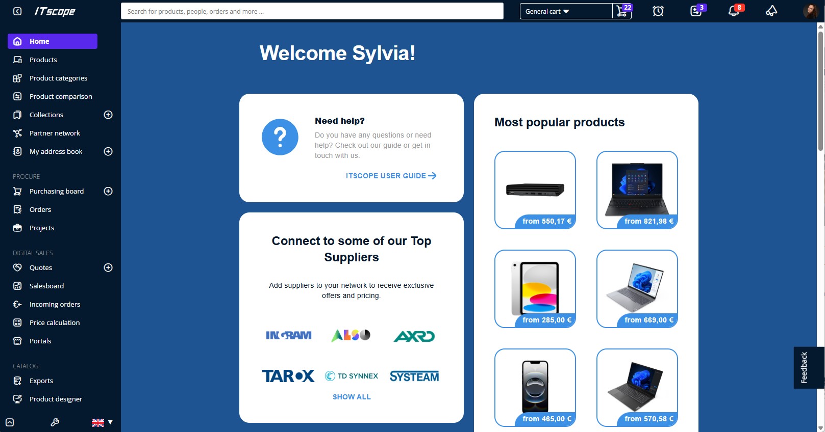
New “Home” Page: Try It Now
We’re also updating the ITscope start page. This includes a change in naming: in the future, it will be called “Home” instead of “Dashboard” in the navigation. The layout is being redesigned so you can see the most important information at a glance. You can already preview the new version:
Profile icon (top right) → “Test lab” → “Activate new home page”
It Pays to Stay Tuned
Many improvements are already in place—such as clearer order status displays—and we’re continuing to enhance the platform. Our goal is to help you work more efficiently, with less effort, better visibility, and stronger decision-making. Even if some changes take a moment to get used to, they’re designed to make your day-to-day work smoother in the long run.